[Originally published on Medium in 2017, as part of a class that was focused on online communities]
For the past few months, two teammates and I have been interviewing Dribbble users to ask them how they use the site and their thoughts on the community. Dribbble interested us because of the abundant positivity of user interactions, the mix of high quality work, and the invite-only system. We sought to discover what users thought about these three elements, as well as get a sense of their overall experience with Dribbble.
TL;DR
If you’re just here for the highlights:
- Designers on Dribbble want constructive feedback but aren’t getting anything useful from comments
- Dribbblers appreciate meeting up in person, it’s often the only online community meetups they go to
- Many use Dribbble as their source for inspiration
- Dribbble is like the design equivalent of Instagram, designers post somewhat but not too curated pieces of work
- Lower follower accounts think invite system should stay, higher follower accounts say do away with it and focus on having people post more frequently
- Giving out a Dribbble invite feels like a sense of duty to maintain the quality of the communit
Research Method
The research consisted of 11 semi-structured interviews with Dribbble users from a variety of backgrounds including illustration, UX design, and motion design. Here’s a broad breakdown of the people we interviewed:
- 3 influential users (2000+ followers)
- 5 average users (100+ followers)
- 3 beginner users (1+ followers)
Afterwards, we codified and affinity mapped our data to draw out key themes and topics that arose from the interviews.

How Would You Describe the Dribbble Community?
Our first set of questions asked designers how they felt about the Dribbble community and how they interact with other users. We wanted to see what people thought of their fellow Dribbblers and how feedback works in the comments.
“It’s a strange thing that a community on the Internet might actually be too positive.”
When designers go on Dribbble, many are seeking feedback from fellow designers on how their work could be refined. Dribbble’s guidelines provide explicit directions regarding feedback and encourage other users to “make it meaningful” when commenting.
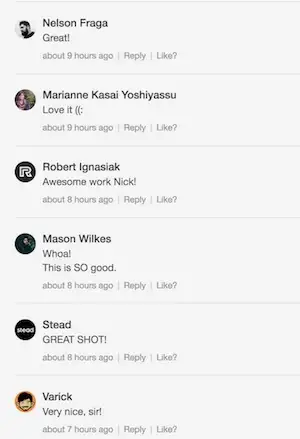
The guidelines go on to say “If you add value to others’ work, they’re more likely to be interested in yours.” However, most comments on Dribbble do not meet any bar of criticism whatsoever. Typically when visiting a post, comments will consist of a variation of “Great shot!” or “Nice job!”

These comments unintentionally create a standard that feedback is only supposed to be positive and make critique less likely due to the “feel good” nature of the commentary. Due to this norm established by the Dribbble community it can be hard to break the established convention to point out a design could be better or has failings in certain areas.
One designer who said he has tried to offer critique said he was met with negative reactions and users being “defensive about the choices they made and why they made them.”
“We would really benefit more from constructive criticism.”
Dribbble’s tagline is “What are you working on?”; the aim of the site is for designers to post projects that they are actively engaged in and developing.
However, “What are you working on?” has become “Show what you’ve done”, as one designer put it. Work in progress shots that are great for critique have been replaced by finalized designs that don’t need any feedback.
Dribbble is not seen as a place to go for critique for any of the designers we interviewed. Instead if they have a piece that they are working on and want feedback on it, they will ask colleagues, friends, and art directors. One designer we interviewed even explicitly said “Dribbble is not for critique.”
Dribbblers lamented the fact that feedback on the site is scarce and that the Dribbble community as a whole would benefit from more critique and less “pats on the back.”
“There’s something when you can actually meet the people whose work you’ve been looking at.”
Dribbblers like meeting up in person. There’s a dedicated local section on the site to see designers in your area and for upcoming meetups around you. Most of the designers interviewed had gone to a local Dribbble meetup, and for a variety of reasons.
Some liked being able to meet designers whose worked they had admired on the site and having the ability to talk to them in person. Others appreciated how designers on Dribbble were very into design both on and off-line, which meant they were always willing to talk about latest design trends or tools. A couple designers even got employed by talking to other Dribbblers IRL.
Why Use Dribbble?
Dribbble is often the first destination for a lot of designers when trying to solve a problem or to show off work to others, but why? We asked Dribbblers to explain what they do on the site and what makes them use Dribbble over other portfolio or design sites.
“I go there for inspiration.”
To no one’s surprise, “Inspiration” ranks as the top reason our interviewees use Dribbble; the word appears at least 37 times in our interviews. Dribbble’s popularity and quality makes it the destination to be exposed to a lot of design work.
“Dribbble is fast food, you get your Big Mac, your fries, a soda, and go, while Behance is like a family dinner.”
Compared to its competitors, designers see Dribbble as a more of a “one-off” platform, whereas Behance is more a place to post case studies and describe an entire process. Ello was also brought up, as a “raw”, “vulnerable” and “free” platform compared to Dribbble where shots require more curation and self-selection. If Ello is Snapchat, then Behance is Flickr and Dribbble is Instagram.

“When I look at something really really detailed… I’m like ‘Geez I have no idea how they did that.’ And that’s really inspiring.”
Another element of visiting Dribbble is obviously the fun. Seeing designs on Dribbble that just make you awe-struck are a humbling and awesome experience of the site.
What Are Your Thought on the Invite System?
Probably the most important design choice of Dribbble was creating an invite-only community. Only current users are able to send invites to join the site, which is unique in the age of social media where anyone is free to post and share content. We asked designers their thoughts on the invite system and how it affects the community.
“I think [the invite system] keeps a sort of baseline of quality to [Dribbble].”
Most Dribbblers felt the invite exclusive approach was a good thing, as it maintains quality among the community since they are the ones to decide who gets to become a contributor. Designers that we talked to mentioned that they had observed other non-invite communities devolve into people “just throwing up stuff they like” or had issues with plagiarism.
“I think they should just open it up to everyone at this point.”
Interestingly, those we interviewed with higher follower counts said that the invite system isn’t really needed anymore, they thought the community had already grown so large that it should be accessible to everyone now, and Dribbble would be able to police itself regarding quality concerns.
One influential user commented that rather than inviting new users, the more important thing is for users to post more often, as more content helps the community practice critique and see more sources of inspiration. They saw the invite system as adequate, but not necessarily the best for creating an environment of constant creation.
“Having an invite is a little bit like a sense of duty, like you don’t want to invite someone that isn’t going to be a good contributor.”
Once people receive an invite to give out, they have a decision to make about who to give it to. We discovered that this decision is not a simple one. Users feel a sense of responsibility and pressure with their power to invite: “you have to invite someone who is going to contribute.”
This was surprising given that who invited who isn’t communicated in Dribbble’s UI. Sometimes a new user will thank whoever gave them an invite (which seems to be a somewhat common practice), but finding out who invited who to the community can be a difficult if not sometimes impossible task.

Conclusion
Hopefully these findings provide some interesting reveals and food for thought for the Dribbble community. What stands out most to me is the problem of getting feedback on our work.
We as designers are always looking for feedback wherever we can get it, and Dribbble seems like the most obvious hub for it. However, because of the current nature of Dribbble comments and the community, it can be hard, or even sometimes discouraged, to give critique on Dribbble despite it being originally intended for exchanging feedback.
There are some design solutions that Dribbble could try to foster more meaningful feedback in the comments, but overall the responsibility lies on the community to change Dribbble’s culture. If designers truly wish for Dribbble to become a place to get feedback from some of the best designers across the globe, the change has to start with the community.
So next time you see a design you really like, try to leave a more significant comment than “Nice job!”, tell the designer what you like and what can be better so they can take their design to new heights. Together we as a community can make Dribbble more fun, more productive, and more meaningful.
Thanks for reading!