A few weeks ago I had the privilege of attending GDC to see industry talks and meet developers building on the Quest platform.
Here are some of the highlights I saw during my time there and what I took away from them:
Tokyo Game Show VR
Tokyo Game Show (TGS) is a major conference for game announcements from Japanese studios like Square Enix, Bandai Namco, Capcom, Konami, etc. The past two years they’ve built VR environments / metaverses for anyone not attending the conference to experience the new game announcements and environment of the expo virtually.
The setup was one giant virtual world split up into themes, and each theme hosted exhibitions from different game studios showcasing their IP and video trailers of their announcements from the expo. In addition the world was multiplayer, so you could chat and travel around seeing other visitors to help bring the conference to life.
They boasted some pretty great metrics engagement wise, last year they saw 398K visitors with the average user spending 33 minutes in their world, with 58% of those users using VR. 77% of users were in their 20s and 30s so hitting that younger demographic, and participation from 50 countries.
The reason for their high engagement seemed due to their mechanics, which were surprisingly robust for a temporary 4-day event:
- Avatar customization where you could equip clothes and props from famous IPs like Yu-gi-oh, Street Fighter, Final Fantasy, etc
- Quests to accomplish throughout the event, which would unlock new cosmetics and stamps to use for the conference (~60% of their players finished all the quests! and there were quite a few to complete when I demo’d on the show floor)
- A narrative sense of progression, as you accomplished quests more of the virtual world would unlock for you to explore until you got to the core of the world
- Built in Twitter sharing of photos from the camera tool they provided in VR
- It’s plain cool to stand under a Gundam or next to Sephiroth in life-scale immersion, and they received the assets right from the game developers themselves so they were all high quality models
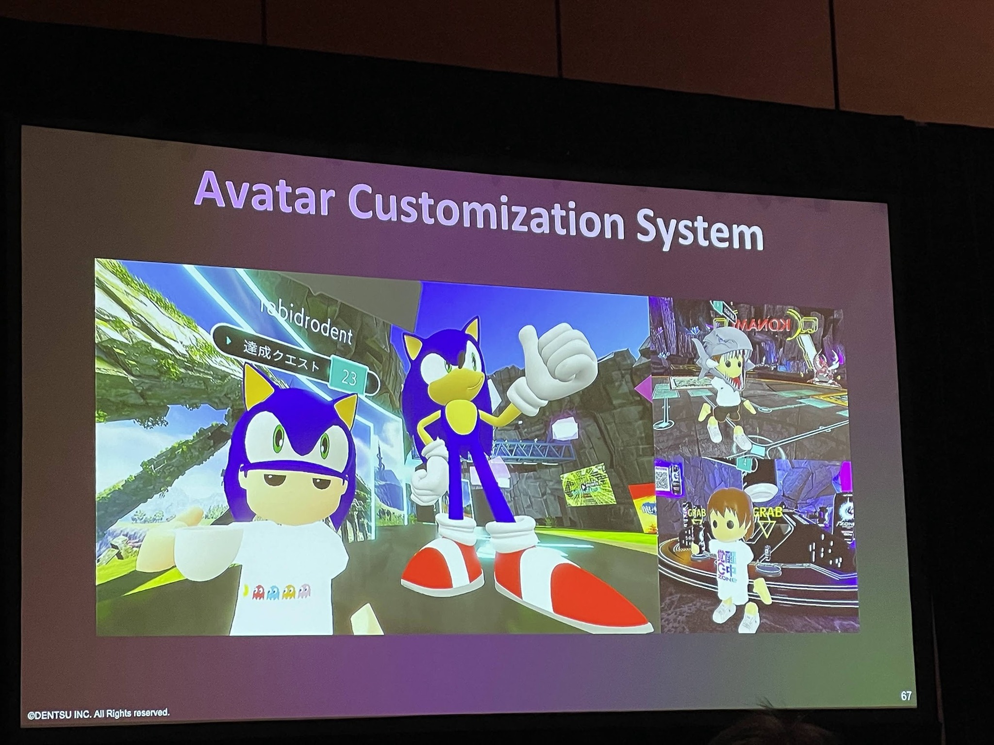
The avatar customization system
They’ll be doing a 3rd iteration of the VR experience this September, so keep an eye out on the Quest App Lab to try it out! The event will run for 11 days.
A Practical Design Playbook for Digital Thriving in Games
A talk by Blizzard and Riot researchers on how they encourage positive player experiences and game communities as well as practical design solutions to assess risk of different mechanics and how to handle bad actors, very relevant for Integrity teams especially within Horizon.
Digital Thriving was defined as: the outcome of online spaces intentionally designed to foster combined feelings of well-being, accomplishment, belonging, and meaningful relationships in individuals, groups, and communities.
They provided examples of plays — best practices for designers, for different mechanics. Each of these plays combine to be a playbook, a reference material for designers to use when wanting to encourage a certain type of behavior from players.
One example we looked at was voice chat and methods to mitigate abuse of it, I thought there were some interesting examples here like time banks so people can only talk for so long, or requiring push to talk to each communication has to be more intentional and thoughtful. These plays also aren’t exclusive and can be mixed and matched as shown in the Pro Tips section on the right.
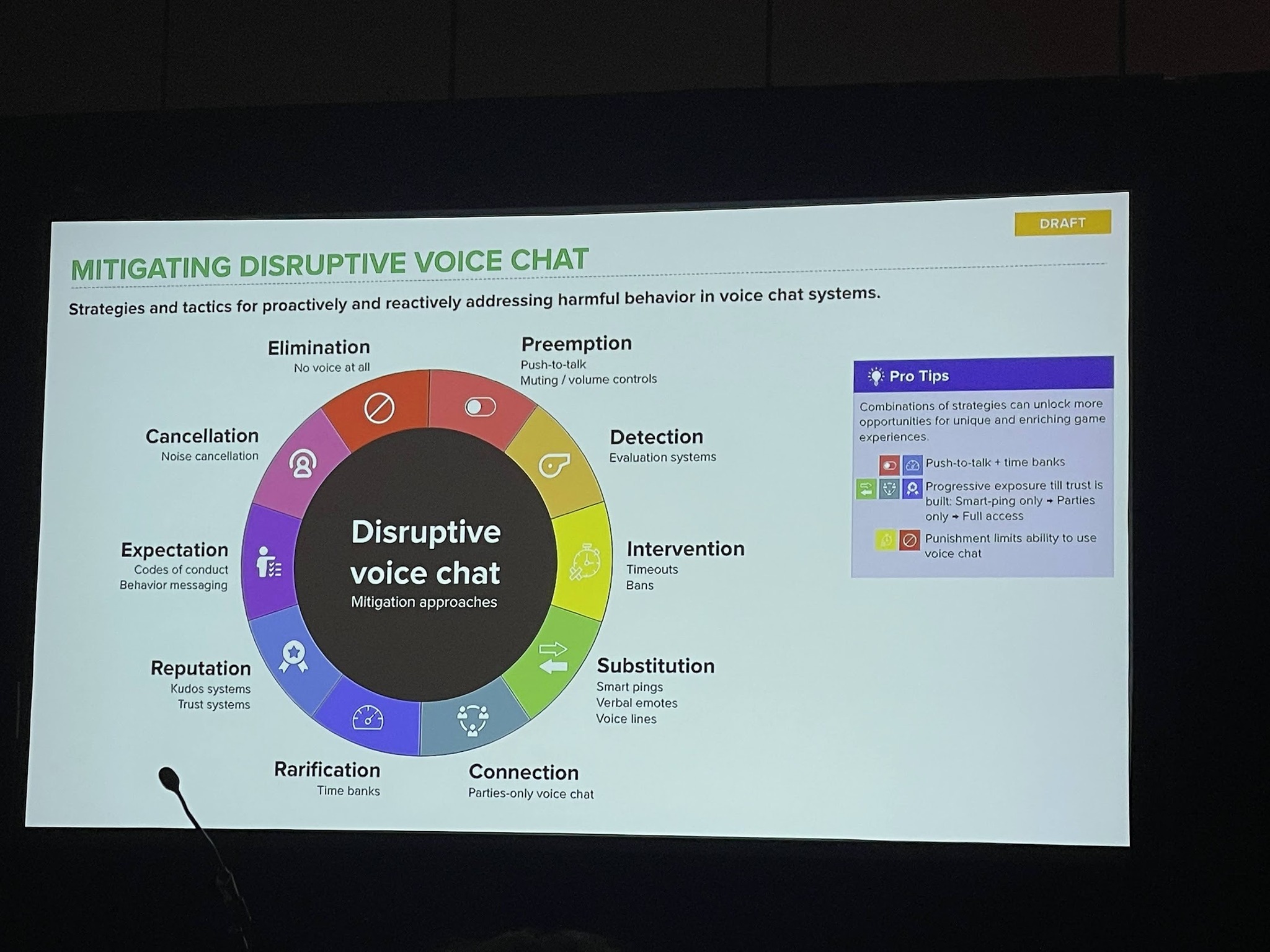
An example playbook for mitigating voice chat
In the Q&A I also asked examples for how they approached building for user trust in their systems, something I know Meta is lacking in. They provided an example of using bystander reporting where they tell users who were in a session with a disruptive player that a report against that player was actioned upon, even if they were not the ones to report them, in order to build trust to all players that reporting does work, so they might do it the next time they encounter a toxic user.
Designing Through Dissonance: Confronting Feedback with an Open Mind
This was a talk from Mark Stuart, a Design Director at Insomniac Games, on how to approach user feedback and four heuristics that designers tend to fall back on when they disagree with the feedback:
- The design is solid: the core idea is good, it’s just the execution that is lacking
- Get good: the player just isn’t good or familiar enough with the game or genre, it’s their fault
- There’s precedent: this has worked in previous games before, so it should work here
- There’s no time: we can’t make any changes in time for launch
All sound very similar to responses I’ve heard to user feedback at Meta as well, and Mark then broke down how he’s challenged those biases to improve games for the better.
Some standout examples he showed included:
-
Spiderman Taskmaster challenges on the PS4, where players were unable to complete the challenges because they demanded too much accuracy.
- The team just thought the players were not good enough, but eventually they realized that it wasn’t empowering or worth it for players to have to get really good at web-slinging.
- Instead it was more important to think “What would it take to accommodate the player? Do they conflict with the game’s vision or core?”
- My takeaway: Make sure you don’t get too caught up in the execution of your design to dismiss accessibility or accommodations for users less familiar with your surface or VR
-
Trying to give Ratchet and Rivet different properties in Ratchet and Clank: Rift Apart but it wasn’t testing well; users could not recall which character had which weapons or movement traits
- The team didn’t understand as there are lots of games where characters have different traits, like Resident Evil 4 or Super Mario Bros. 2
- But in those games you stay as those characters consistently, rather than swapping around like what happens in Ratchet and Clank, it’s important to analyze your precedent in-context of their design decisions
- My takeaway: When leaning on design precedent, make sure to account for the reasons they made the design the way it is rather than taking it at face value
-
Design directors wanted to change the flying blimp sequence in Sunset Overdrive to simplify it and make it a bit less janky
- The team felt there wasn’t enough time to make any changes and pushed back
- “We tried nothing and nothing worked”, he still regrets not changing it to this day and has lots of potential solutions of what they could have fixed
- in the timeframe
- My takeaway: It’s always worth exploring solutions, even when on a tight timeline, to see if something can be fixed
Mark also provided some nice framing on when you receive negative player feedback you should always segment it into two parts:
- The experience: how the player feels at the moment
- The suggestion: what a player thinks would solve the issue, but as a designer you should feel free to discard it as long as you have a solution addressing the experience
Mark mentioned that you should challenge yourself to create drastic solution for the feedback, which even if it won’t ship will help unblock your design process or might discover a new direction, which I really appreciated.
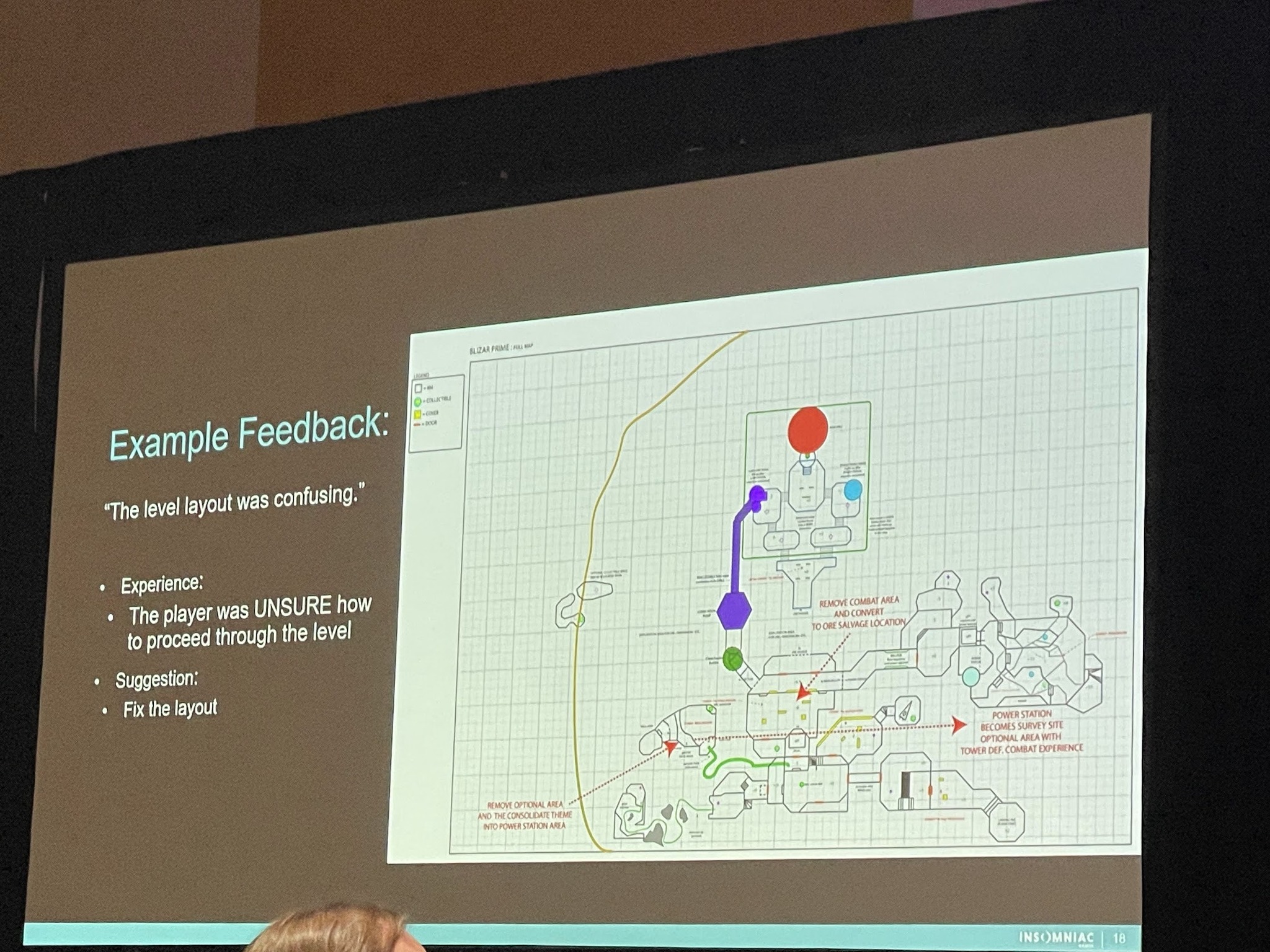
Breaking down feedback
How to Build a Home: Designing Narrative for Sindri’s House in ‘God of War Ragnarök’
A fun talk from Harleigh Awner, a narrative designer at Santa Monica Studios, how they approached building a living home for the player in God of War. I was hoping this talk would focus on how they evolve the Home environment as the game progresses, but the talk was actually focused on how NPCs interact with each other without player input to build the illusion of a real world where not everything revolves around the main character.
There were some interesting snippets though, such as how they explored a Dynamic Narrative Moment, where dialog would play out differently depending on if a player decided to participate in the conversation or not. However what they found in testing was that all players decided to participate in the convos, and they were over-designing for what the player could do, not what they would do, which is a trap we UX designers can definitely fall into as well.
One other nice design touch I could see be useful for accessibility is how they approached subtitles, based on the distance from the NPCs the subtitles would disappear so you wouldn’t be seeing text for conversations you could no longer hear, which sounds like a useful mechanism to user for things like live subtitles of conversations I could see us using in the future.
The Show Floor
Of course I also took the chance to walk around the show floor and chat with developers that I saw using Quests just to hear about their developer experience.
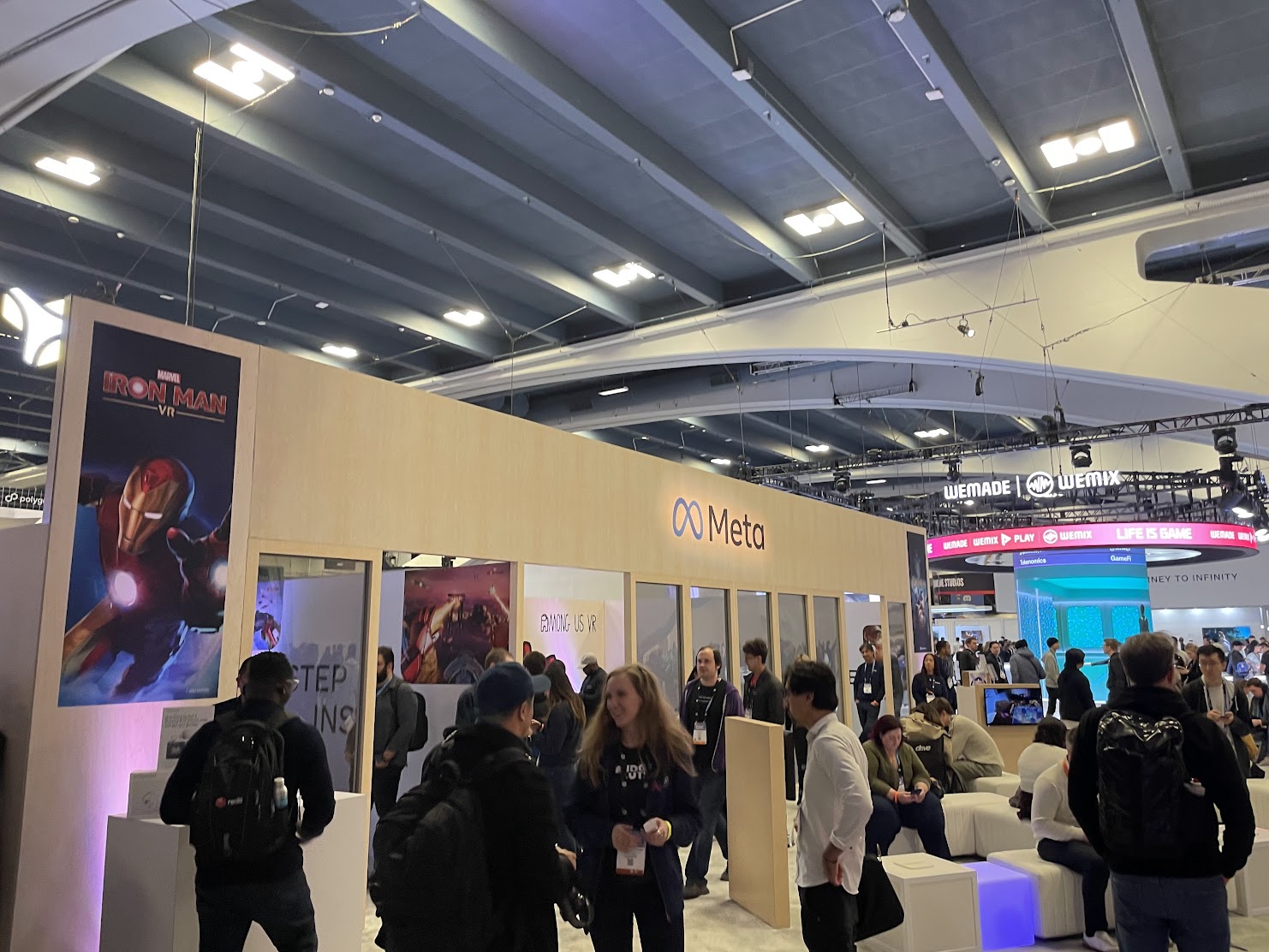
The Meta Booth on the floor
PNI Company
They are building an interesting VR chair accessory where you sit down and control your motion by sliding your feet to turn and pushing your feet to move forward or backward.
I don’t know if I would call it more immersive per se, but it was an interesting look at how to involve your legs in the VR experience. The downside is that it limits you to one controller because the other controller needs to be docked into the chair (not really sure why)
3dar
This company is building a multiplayer MR experience on Quest Pro! It’s called eggscape and their current plan is to only demo at expos or IRL events as multiplayer AR apps sounded difficult to setup on just the user end as they need to have the guardians all matching for their case.
Overall it was exciting to see developers trying to unlock MR experiences (multiplayer even!) on the Quest Pro.
PSVR2
I had to take a chance and evaluate the competition as well, and tried out an bespoke Eye Tracking demo their internal Magic Lab team has built, an prototyping lab in Sony. I chatted a bit with the employees and they discussed how they separated ET use cases as:
- Expression (social presence like moving eyes)
- Input (using eyes for explicit actions)
- Attention (highlight where player is looking + foveated rendering)
These align very similarly to the ET use cases we outlined to users on Quest Pro: social expression, input, and foveated rendering. It’s good to see that competitors are landing on similar cases.
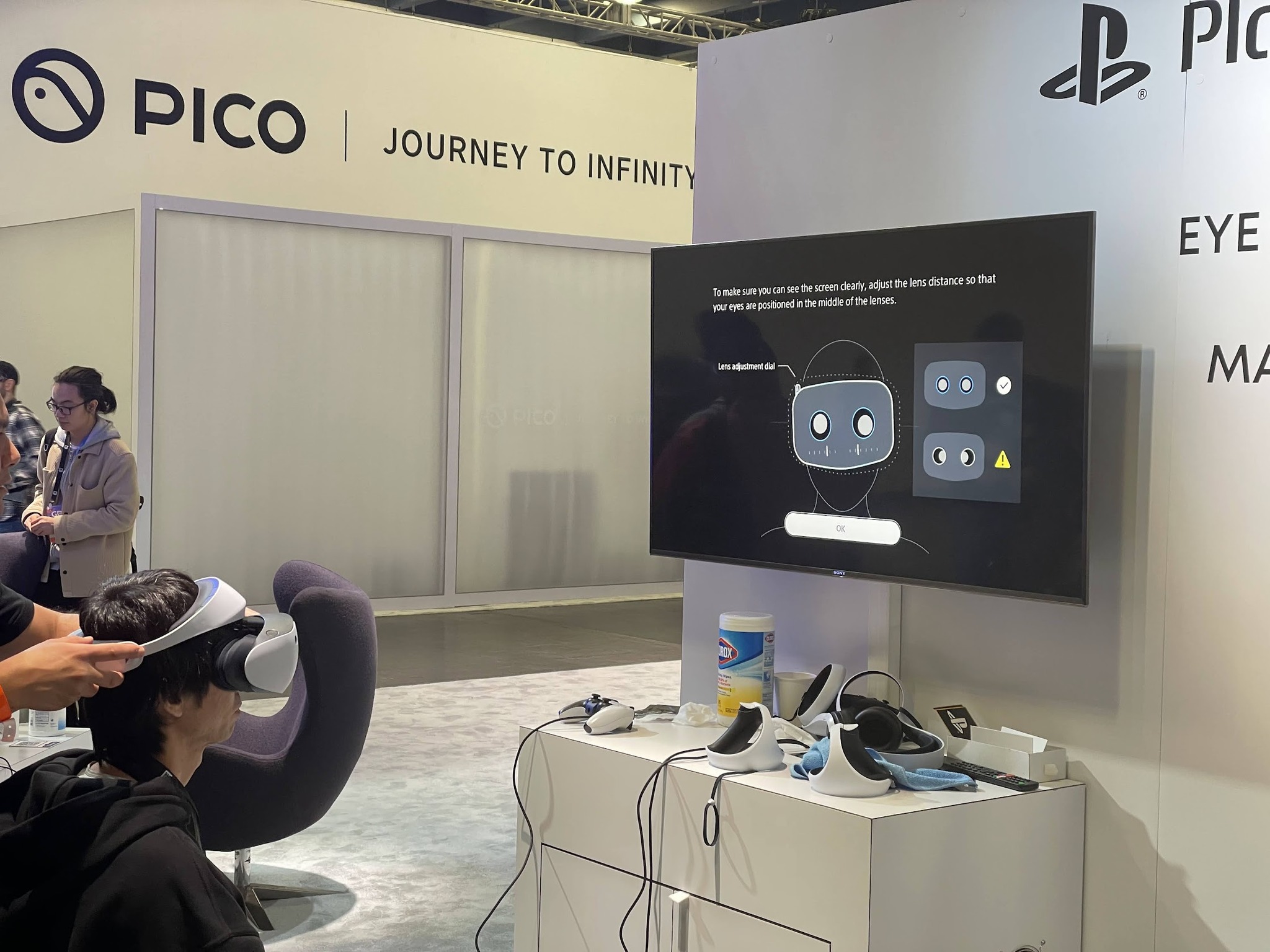
Orthofit experience on PSVR2
For their demo they had the user look at the radio to turn it on and change the channel, which was a fun input experience, and then they also had a TV demo with 3 movies playing at the same time, and looking at one TV would amplify the volume
A user could then pick one of three more involved demos, I selected the input demo where I was given a keyboard that used eye input to type. Honestly I found it tiring and not a great use of eye input, as your eyes are constantly darting around the type in the letters and you quickly get fatigued. Perhaps if they had a better key layout or mechanism they could reduce the eye strain they were introducing but it definitely need some work to optimize for common letters to reduce friction.
I did wonder as I did the demos and such, since they were all set in real world examples (a bar, a party) if this some sort of hint of them thinking around AR use cases.
Conclusion
Overall I found GDC a highly relevant conference to attend as a VR designer. Although the talks focus on games and game design, many lessons and takeaways can directly translate to the UX design practice of designing in multiplayer and 3D spaces. Game designers have been doing similar work for a long time and have a rich pool of knowledge and inspiration to draw from.
It’s also fantastic to see what developers are building on the VR platform and is a reminder of the incredible things possible on Quest by the ingenuity of the developer community.